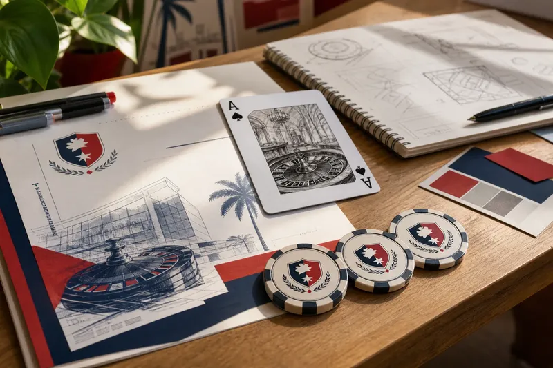
Why Casino Signs Feel Like an Invitation
Casino sign design uses lettering, placement, and material cues to make a fictional entrance easy to read and give a poster a clear sense of arrival.
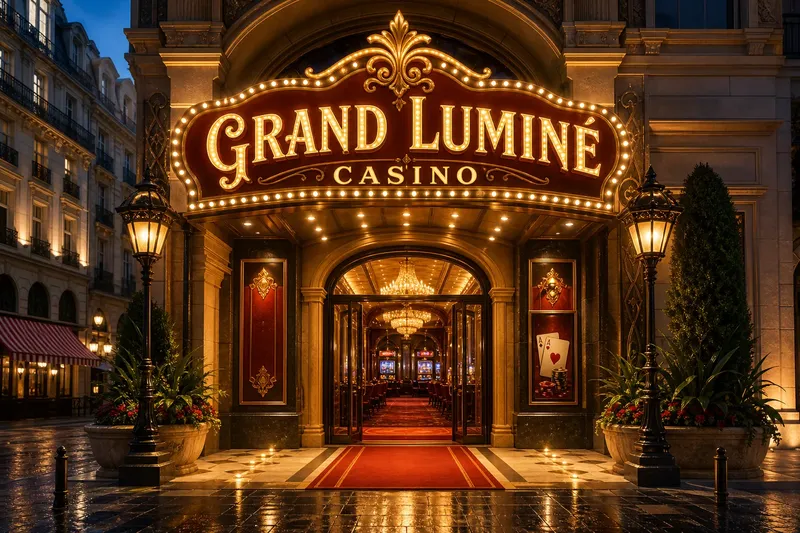
A glowing sign hangs above a narrow doorway in a student’s imagined casino poster. The name reads clearly, but tiny bulbs and a decorative arch compete with it. Casino sign design works best when the sign does more than shine: it gives the viewer a readable point of arrival and a sense of what lies beyond the frame.
That invitation comes from the relationship between type, surface, architecture, and implied movement. The goal is not to imitate every real casino or promise what a venue offers. It is to make a designed scene feel coherent, whether it appears on a poster, a model, or a screen.
What makes a casino sign feel like an entrance?
A sign feels like a threshold when it belongs to the space around it. A marquee stretched over a facade suggests an entrance; a vertical panel beside a drawn door can act like a label; a small illuminated name at the end of a corridor becomes a destination. The surrounding architecture gives the sign a role before anyone reads its words.
Think in terms of a visual route. A doorway, a change in floor pattern, or a line of light can lead the eye toward the name. If every edge points in a different direction, the sign may seem pasted onto the scene rather than part of it.
Say a student’s fictional poster begins with a crowded street scene and a casino name tucked into the upper corner. The student moves the name above the illustrated entrance, removes a competing banner nearby, and draws a brighter path from the foreground toward the door. The expected result is a clearer sequence: viewers can notice the entrance, read the name, and understand where the composition leads. The tradeoff is a less crowded streetscape, which suits the design if arrival matters more than busy surroundings.
How should the name work with the architecture?
Lettering sets a tone before a viewer studies the details. Broad, open forms can feel direct; slanted script can add flourish; tall capitals can lend a more formal note. These are visual cues, not fixed meanings, so judge them against the imagined building and scene.
An ornate display face can work well for a short name, especially when its swashes have room to breathe. Long wording in elaborate script is harder to read if strokes overlap or decorative marks crowd the letter shapes. Pair one expressive face with a quieter style for secondary wording, or use different weights within one type family.
Check spacing at the size and distance the design implies. Closely packed letters may merge into a bright band; widely spaced ones can feel deliberate but disconnected. A quick thumbnail helps reveal whether the name holds together as a shape as well as a word.
What should the viewer notice first?
Give each element a distinct job. The name identifies the imagined destination. A short secondary line can establish tone or clarify the scene. An arrow, doorway, or frame can guide the eye onward, while decorative motifs support the reading rather than interrupt it.
Try viewing the design as a small thumbnail or squinting at it from across the room. If a border or ornament grabs attention before the name, reduce its emphasis. If the secondary line vanishes, decide whether it needs more contrast or can be removed.
Color is only one way to separate elements. A broad nameplate against a narrow facade, a framed panel within an open wall, or a sharp-edged letter beside a rounded arch can create distinction through form. Choose a shape that reinforces the imagined architecture instead of adding an unexplained flourish.
How do color and materials change the mood?
Warm amber or red can suggest spectacle; cool blue or green may feel more restrained. Those impressions shift with neighboring colors and the setting. A strong palette needs a clear lead: if every element glows with equal intensity, the viewer has no obvious place to begin.
Material cues can make the sign feel like an object in a designed space. Drawn bulbs evoke a theater marquee; a polished edge suggests metal; a matte panel can make bright lettering feel controlled. In a poster or illustration, a few highlights, textures, or edge treatments can suggest these surfaces without rendering every detail.
It is not worth adding a glow, bevel, shadow, and metallic texture to every letter. Those effects can muddy the name and make the sign feel less like a considered object. Choose a small number of cues that explain the material, then let the lettering and structure carry the rest.
How do scale and placement affect the reading?
A sign that feels intimate up close may become anonymous across a room. Large, simple letterforms tend to hold their shape at a distance, while fine outlines and tiny flourishes can disappear. A close interior scene can support more detail; a distant facade usually benefits from a recognizable silhouette and a readable name.
Make a rough mock-up in context before polishing the surface. A paper sketch placed over a doorway photograph or a simple digital composite can show whether the sign feels detached, undersized, or overpowering. For an actual installation, technical requirements call for an appropriate qualified professional; a visual mock-up is not a substitute.
Placement also changes the sign’s apparent role. Over a doorway, it can mark a threshold; at the end of a corridor, it can become a focal destination; beside an entrance, it may read as a label. In an illustration, position and surrounding lines can imply a route without adding explanatory text.
What questions help refine casino sign design?
How many typefaces should a casino sign use?
Start with one expressive style for the main name and a simpler style for supporting words. If both compete, use a single type family with contrasting weights instead.
Does a casino sign need neon?
No. A strong silhouette, theatrical lettering, or a bright border can suggest spectacle without neon. Choose the treatment that fits the imagined setting and keeps the name easy to read.
How can a sign suggest an entrance without making promises?
Use a clear name, an open frame, or a path implied by the composition. Keep wording descriptive, and avoid claims about outcomes, services, or what a visitor will experience.
How can I tell if the sign belongs in the scene?
View it in context as a thumbnail and check whether its shape, lettering, and placement connect to the surrounding architecture. If it looks pasted on, adjust its position or echo a nearby architectural form in the sign’s frame.
Which details should you check before polishing the sign?
- Check whether the name is the first element noticed; if a border or ornament leads instead, reduce its emphasis or enlarge the name.
- Check whether the letters remain distinct at thumbnail size; if strokes merge, open the spacing or choose a simpler typeface.
- Check whether the sign’s shape relates to the nearby doorway or facade; if it feels detached, echo an architectural edge or move the sign closer to the entrance.
- Check whether the secondary line can be read at the scene’s implied distance; if it disappears, strengthen its contrast or remove it.
- Check whether color alone separates the name from its background; if the words blur in grayscale, add a value difference, outline, or clearer shape boundary.
- Check whether material effects obscure the lettering; if they do, remove a glow, shadow, or texture and keep the cues that best explain the surface.
For casino sign design, the useful test is not simply whether the panel looks bright. Ask whether it feels attached to its imagined place, whether the name is easy to find, and whether the composition points somewhere. A restrained design can still make a doorway feel like a destination when those choices work together.