A Chip, a Card, or a Printed Token?
Choose casino-themed props that make a scene easier to read: compare how chips, cards, and printed tokens signal value, attention, and identity.
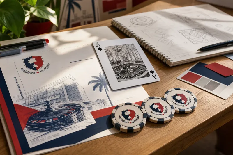
On a tabletop, a small stack of chips catches the light while a face-up card draws the eye and a paper token sits near the edge. Each prop makes a different promise before anyone reads its markings. For an RMIT Vietnam-inspired design project, choosing among a chip, a card, and a printed token starts with the job the object needs to do.
Think in terms of visual signals rather than casino authenticity: does the scene need to suggest collected value, present a revealing image, or connect an imagined event to a place? The answer shapes the object’s silhouette, surface, and position in the composition.
What does a casino chip signal at a glance?
A chip reads as a compact unit that can be gathered, counted, or held back. Its round silhouette, central mark, and patterned edge remain recognizable in a stack or loose cluster. A visible rim and small cast shadow suggest thickness in an illustration without requiring intricate rendering.
Arrangement changes the mood. A tidy stack suggests order or restraint; a loose scatter brings movement to a tabletop. Neither arrangement needs a readable denomination if the scene’s purpose is simply to evoke a collected unit of value.
The repeated shape is useful for building a visual family. Keep the outline consistent while varying a center emblem or edge pattern, and the objects feel related rather than like unrelated decoration. A chip is less suited to detailed information, though: lettering squeezed into its small face can become visual noise.
Why does a card draw more attention?
A card offers a broad, flat face for a symbol, image, or short message. Its border and corners define a clear reading area, so one card can act as an individual focal point rather than another unit in a pile.
Cards also carry a sense of handling. A fan shows several backs while keeping the faces hidden; one face-up card reveals a chosen image. That contrast can suggest secrecy, choice, or display, depending on what surrounds it.
The trade-off is visual dominance. A high-contrast card can pull attention away from other parts of a composition, so reserve the face-up position for an image or message the scene actually needs to show.
When is a printed token the clearer choice?
A printed token can belong to a particular venue, event, or imagined institution. It may be round, ticket-shaped, or cut to a custom outline, with space for a crest, date, or short phrase. That flexibility makes it useful when the design needs a distinct identity rather than a familiar playing-card motif.
Repeat the token’s emblem on a poster, table card, or illustrated setting to link those objects. But a token does not automatically read as valuable or even as a token: without a distinctive edge, mark, or placement, it can look like a badge or scrap of paper. Give it a clear role in the scene, then let the graphic treatment support that role.
How do weight, shape, and repeated marks guide the choice?
Start with the scene’s strongest visual need. Thickness, overlap, and shadow suggest weight; silhouette determines how quickly an object reads; recurring marks tie multiple props together. One cue can lead while the others stay quiet.
- Check the scene’s main action: If objects are being stacked or gathered, choose a chip; if not, try a card or token that better serves the focal point.
- Check what the viewer must notice: If a face or image needs attention, use a card; if the surface is not meant to be read, choose a simpler chip or token.
- Check whether identity must recur: If a crest needs to connect several pieces, choose a printed token; if there is no recurring identity, avoid adding a token just for decoration.
- Check the silhouette in a small view: If the object remains distinct when reduced or shown in muted colors, keep that outline; if not, simplify its shape or strengthen its edge.
- Check whether the marks have a purpose: If an emblem or border helps identify the object, repeat it; if extra patterns compete with the main image, remove them.
- Check the object’s apparent material: If a chip should feel solid, add a visible rim and restrained shadow; if it should feel printed and flat, leave out those depth cues.
Say you are laying out a fictional RMIT Vietnam campus event poster. Your starting materials are one tabletop illustration, three blank round tokens, one small crest, and a face-up card with an unrelated image. Place the crest on each token, then arrange the tokens beside the table edge; the expected visible result is a repeated identity mark that links the objects to the event. The card still attracts attention but points to a different subject, so the design decision is to remove it or replace its image with one that serves the same event.
Which prop fits the design question you are asking?
Can a printed token look like a casino chip?
Yes. A round outline, visible edge, and central mark borrow chip-like cues, while a custom crest or event name gives the token its own identity.
Which object works best as a repeating graphic motif?
A chip or printed token usually repeats cleanly because its face and silhouette can stay consistent. A card can repeat too, but its larger surface may draw attention to changing images or text.
How can a flat illustration suggest an object’s weight?
Add a visible edge, a restrained cast shadow, or overlap with nearby objects. A stack suggests thickness, while a lone shape without edge treatment may read more like a printed graphic.
Should the prop carry readable text?
Only if the text matters to the scene. A card can hold a short title or symbol, and a token can carry a compact emblem; tiny decorative wording often adds clutter without clarifying the object.
Which small details can you leave out?
Invented rules, denominations, serial numbers, and elaborate edge patterns are not worth the effort if the object appears only briefly. Those details can vanish at viewing distance or compete with the main image. Give each prop one clear job and a few visible cues that support it.
For a chip, that might be a legible center and a distinctive edge. For a card, it could be a strong frame around one image. For a token, try a custom contour and a recurring crest. The choice between a chip, card, and printed token is clearest when the object’s material cues and graphic marks serve the scene’s purpose.